Top 5 Common Small Business Website Mistakes
Introduction
These days, a small business’s website is often the first point of contact with potential customers. However, simple mistakes in web design can significantly impact a business’s ability to engage and retain customers. This article delves into the top five common mistakes small business owners make with their websites and offers practical solutions to avoid them.
Missing the basics: contact information and services
It’s often surprising to see that many small business websites don’t include vital information such as contact details, business hours, services offered, and the areas they serve. When these key details are missing, it can lead to lost opportunities. Potential clients, unable to find the information they need, may choose to do business with a competitor who presents this information more clearly and accessibly.
What you should do
Ensure that this basic but vital information is easy to find and up to date, ideally on the homepage or a clearly marked contact page.
Out-of-date information
Keeping the content on your website current is crucial. Content that is no longer relevant, such as outdated pricing, products no longer available, or events that have already occurred, can create confusion and mislead visitors. This mistake reflects poorly on the professionalism of your business. Regular updates ensure that your website accurately represents your business and keeps customers informed.
What you should do
Make it a habit to frequently update your website, keeping all information about products, services, events, promotions, opening times, and contact details up-to-date.
Not designing for mobile users
In an era where smartphones are ubiquitous, a website that isn’t mobile-friendly is a significant disadvantage. Mobile-friendly design means that your website is easy to read and functional on smaller screens like mobile phones and tablets. Without this, you risk losing a vast portion of potential customers who primarily use mobile devices to browse the internet.

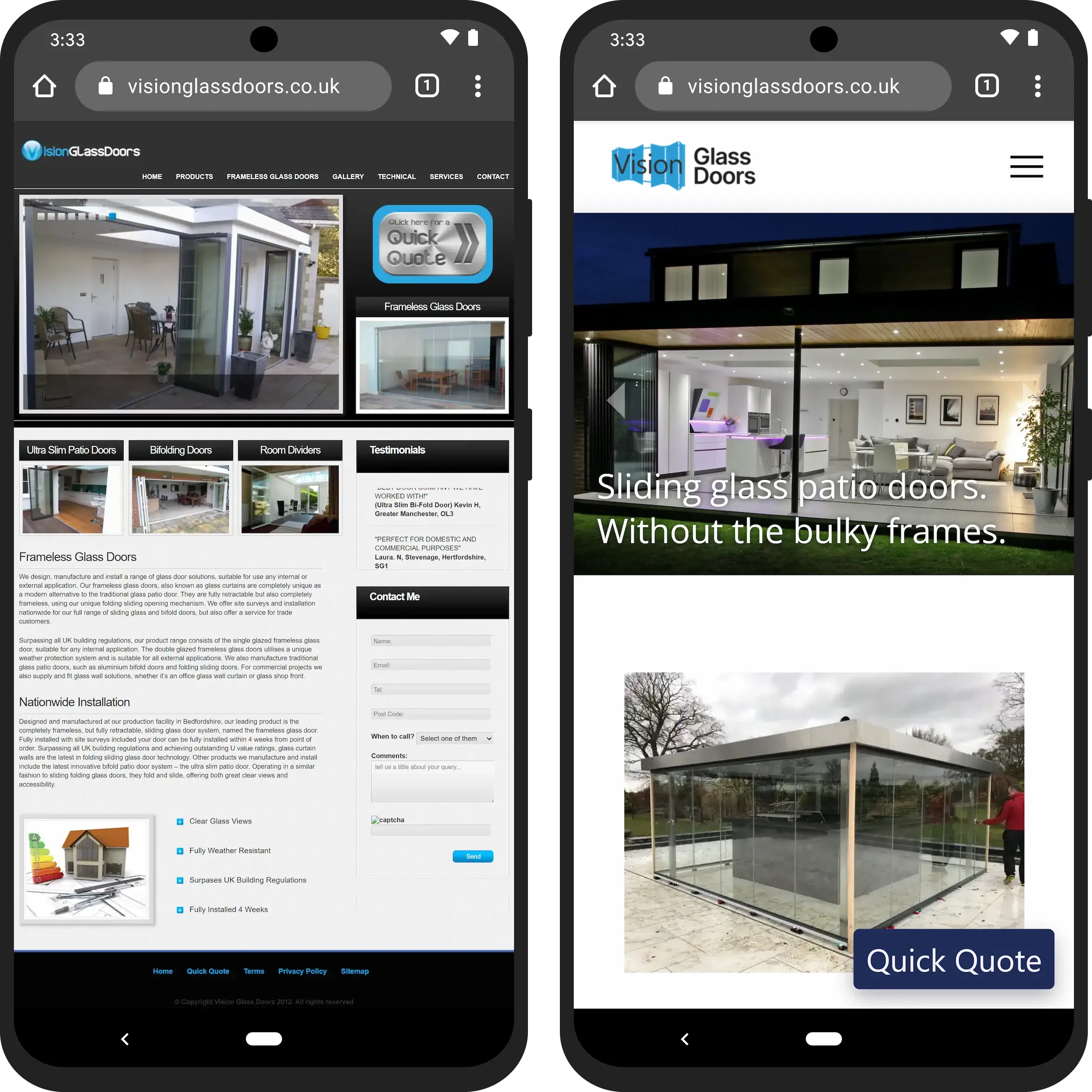
On the left is a website which was not mobile-friendly, and on the right is the same website after we redesigned it. Can you see the difference?
Websites which are not mobile-friendly usually look overcrowded when viewed on a mobile phone, and require zooming in and panning around in order to read the text and navigate.
On the other hand, the mobile-friendly design on the right is functional and easy on the eyes, regardless of screen size. You want to make it as easy as possible for a potential customer to get the information they need to do business with you.
What you should do
Ask your friends and family to test your design on mobile and pretend they’re a potential customer. What does the experience feel like? The process should feel intuitive, easy, and painless.
Using a generic, overused website template

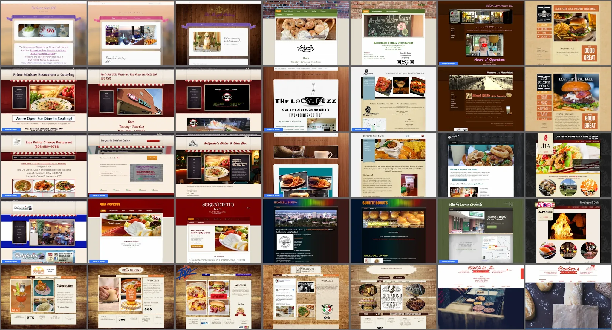
We researched thousands of American websites and a significant number of them use the same DIY website builder templates - below is a selection of them, created with Wix, Weebly and GoDaddy. Do you think your business will stand out from the crowd using the exact same template that everyone else is using? The answer is NO.

We researched thousands of American websites and a significant number of them use the same DIY website builder templates - here is a selection of them, created with Wix, Weebly and GoDaddy. Do you think your business will stand out from the crowd using the exact same template that everyone else is using? The answer is NO.
While using a generic template for your website might seem cost-effective and convenient, it often leads to a lack of uniqueness and brand identity. A website that looks like countless others will fail to make a memorable impression on visitors. Investing in a custom design helps distinguish your brand and can better align with your business’s unique style and values.
What you should do
Spend some time reviewing websites in your industry and work on a design that stands out from the pack. You can hire Boujee Brands to build a compelling website for your niche.
Broken links
One frequent oversight is the presence of non-working links - these are links that lead nowhere, often displaying an error message. These can frustrate visitors and diminish the credibility of your business. Equally important is the integration of your social media accounts. Many small businesses fail to link their websites to their social media profiles, missing out on a valuable opportunity to engage with customers.
Many website templates come with icons or links for social media platforms such as X (formerly Twitter), Facebook, and LinkedIn. By default, the links redirect nowhere when clicked, or they link to the Wix/Weebly etc pages. Small business owners often forget to add their own links here, leading to a sub-par broken experience for the potential customer.
In an era where social media plays a pivotal role in business marketing and customer engagement, not linking your website to platforms like Facebook, X, LinkedIn, and Yelp can mean missing out on valuable traffic and engagement opportunities.
What you should do
Your customers are everywhere, and you should be too. Regularly checking for broken links and prominently displaying social media icons can make your website more user-friendly and connected.
To summarize
A well-designed website is a powerful tool for small businesses.
Avoid making these common mistakes:
- non-working links and missing social media links
- outdated content
- missing basic information
- not using a mobile-friendly design
- using a generic template
Doing so can significantly improve the impression you give to potential customers. Regular updates and a focus on user experience will also keep your website effective and engaging for your potential customers.